Brand Design · Web Design · Web Development
A brand system for a Ghanaian meal delivery service — built to compete with multinationals on a fraction of their budget.
A brand is not a logo. It is a set of decisions made once, so that every later decision is easier.
ChopRight needed to compete with multinationals like Bolt Food and Glovo, and with a fast-growing local player, Chowdeck. The team had a fraction of their budget and headcount. The only way to punch above weight was to build a system tight enough that every touchpoint — from a button to a packaging sticker — felt unmistakably like the brand without anyone having to think about it.
So the work started not with a logo, but with the rules.
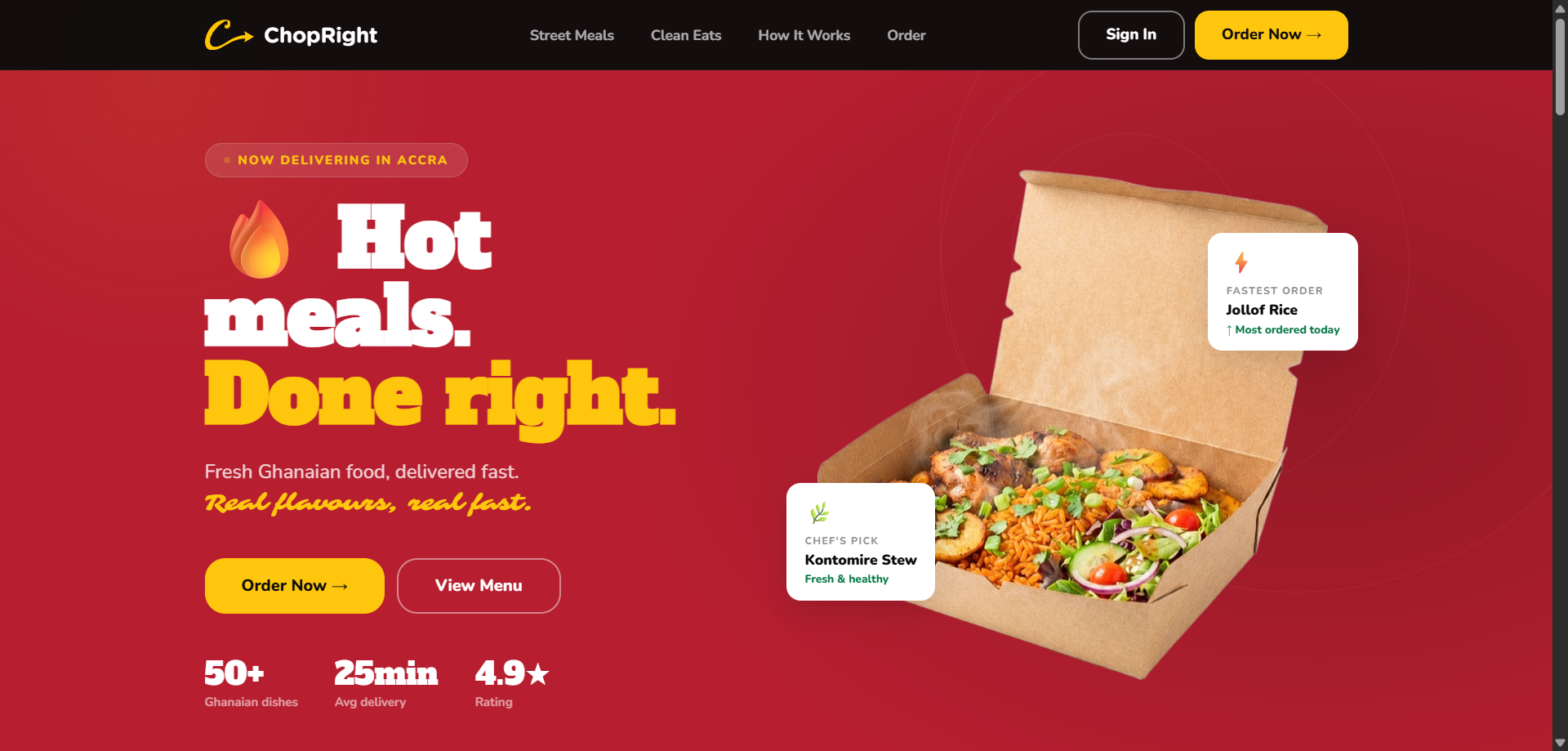
ChopRight delivers locally cooked Ghanaian meals across Accra: jollof, banku, fufu, light soup, grilled meats. Fresh from kitchen to door. The food was strong. The brand was thin.
Three constraints shaped the work.
First, recognition in a crowded market. Bolt Food and Glovo dominate top of mind in Accra. ChopRight needed an identity loud enough to register in less than a second on Instagram, and durable enough to survive being printed on a takeaway box, an app icon, and a delivery rider's bag.
Second, cultural specificity without cliché. A Ghanaian food brand too often defaults to Kente pattern wallpaper. The brand needed to feel local without performing locality.
Third, production reality. A small team. No dedicated designer downstream. Anything built had to be replicable by a marketer in Canva, not just by me in Figma.
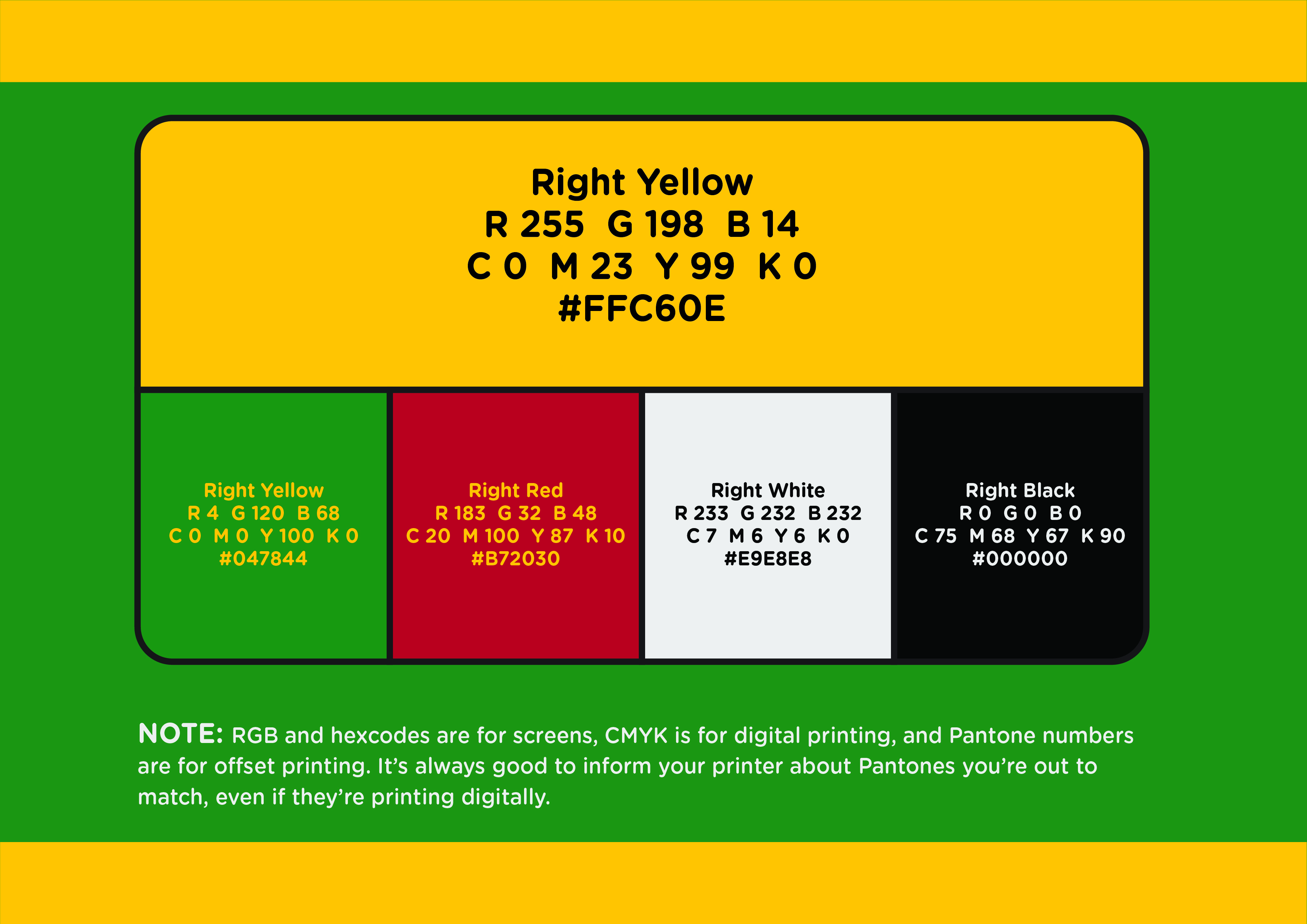
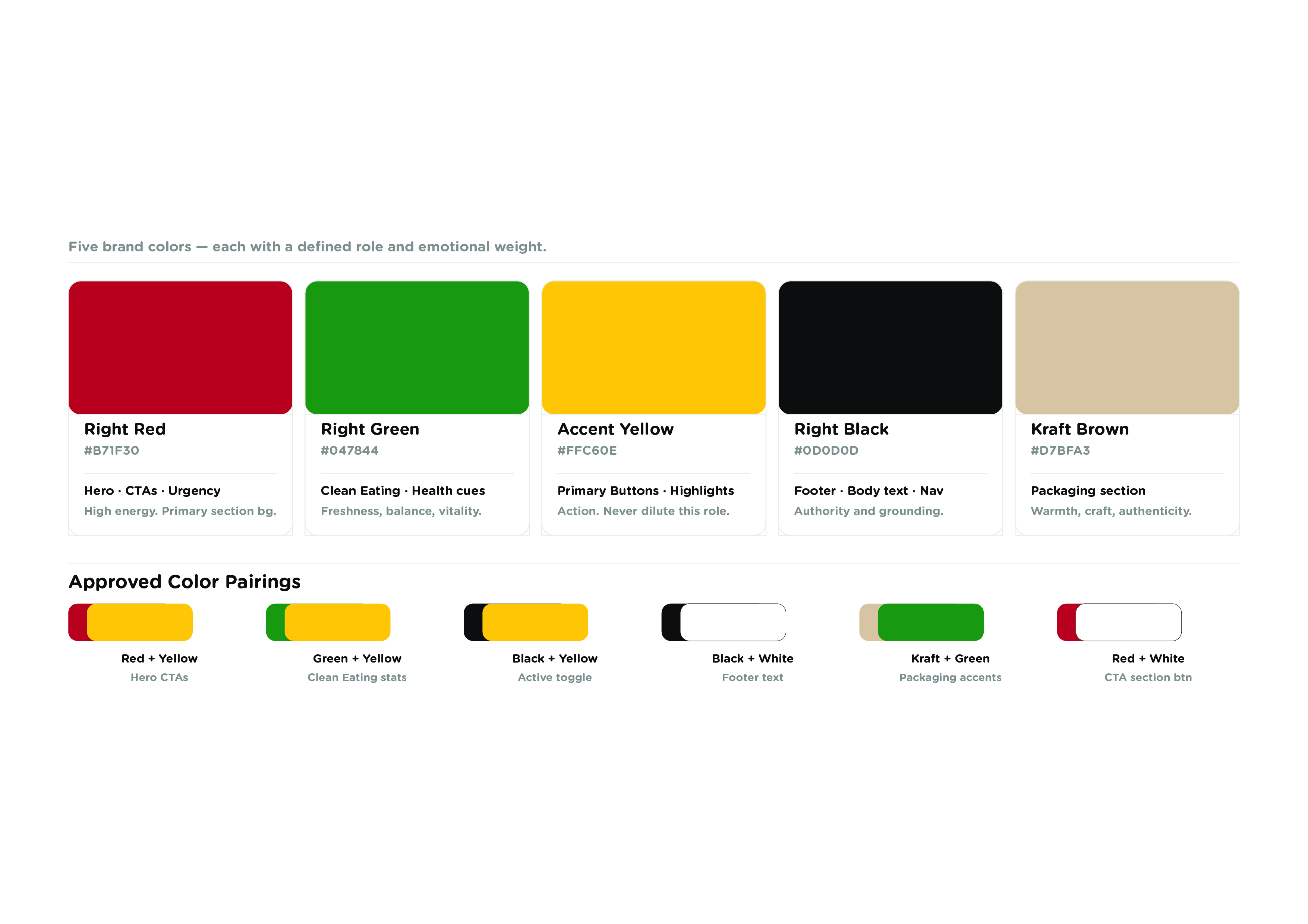
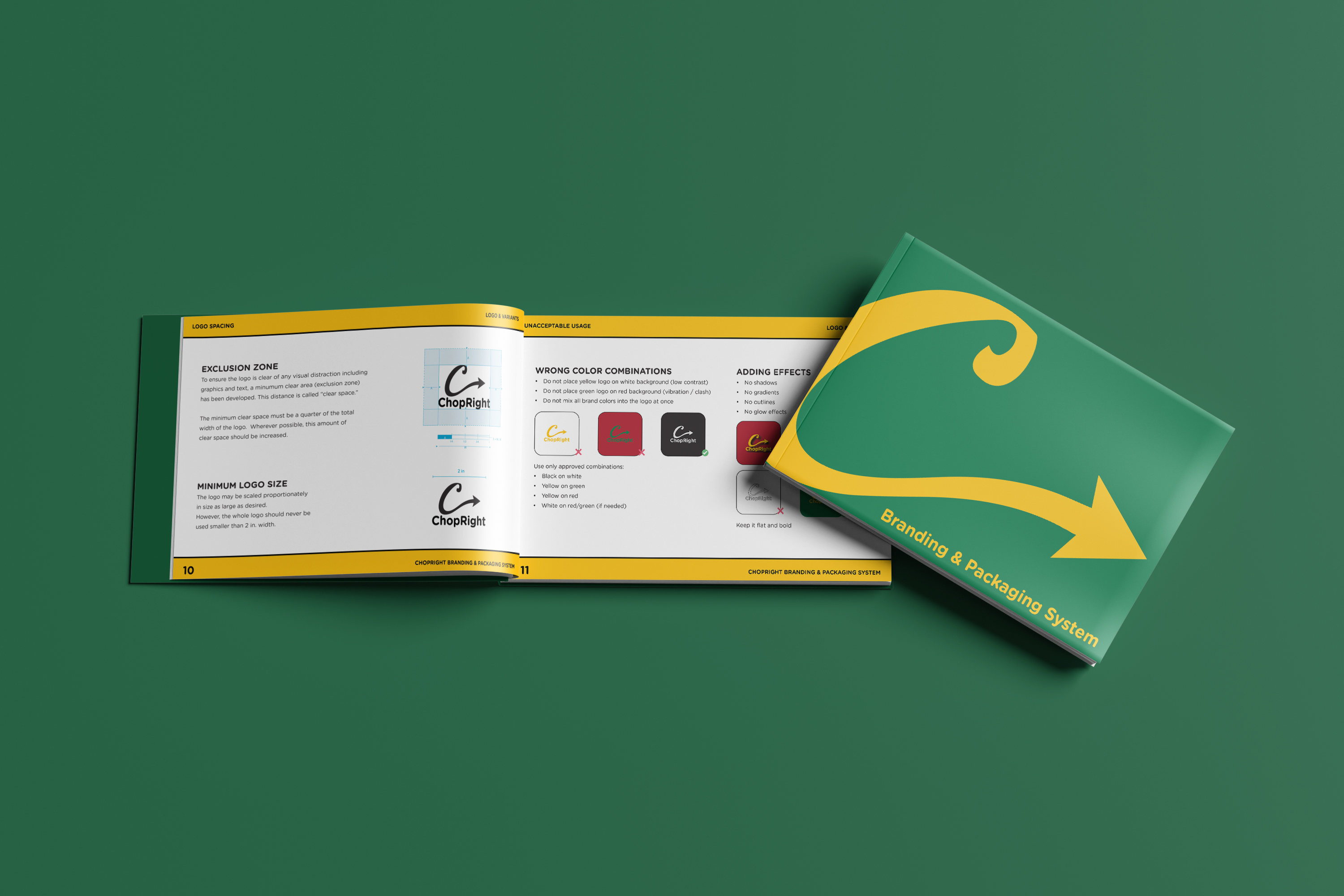
Five colours. Each with one job.
Red, #B71F30. Primary surface. Heat, urgency, action. Used on the hero, on the main CTA banner, on the add to cart button.
Yellow, #FFC60E. Primary CTA on red. The button you actually press.
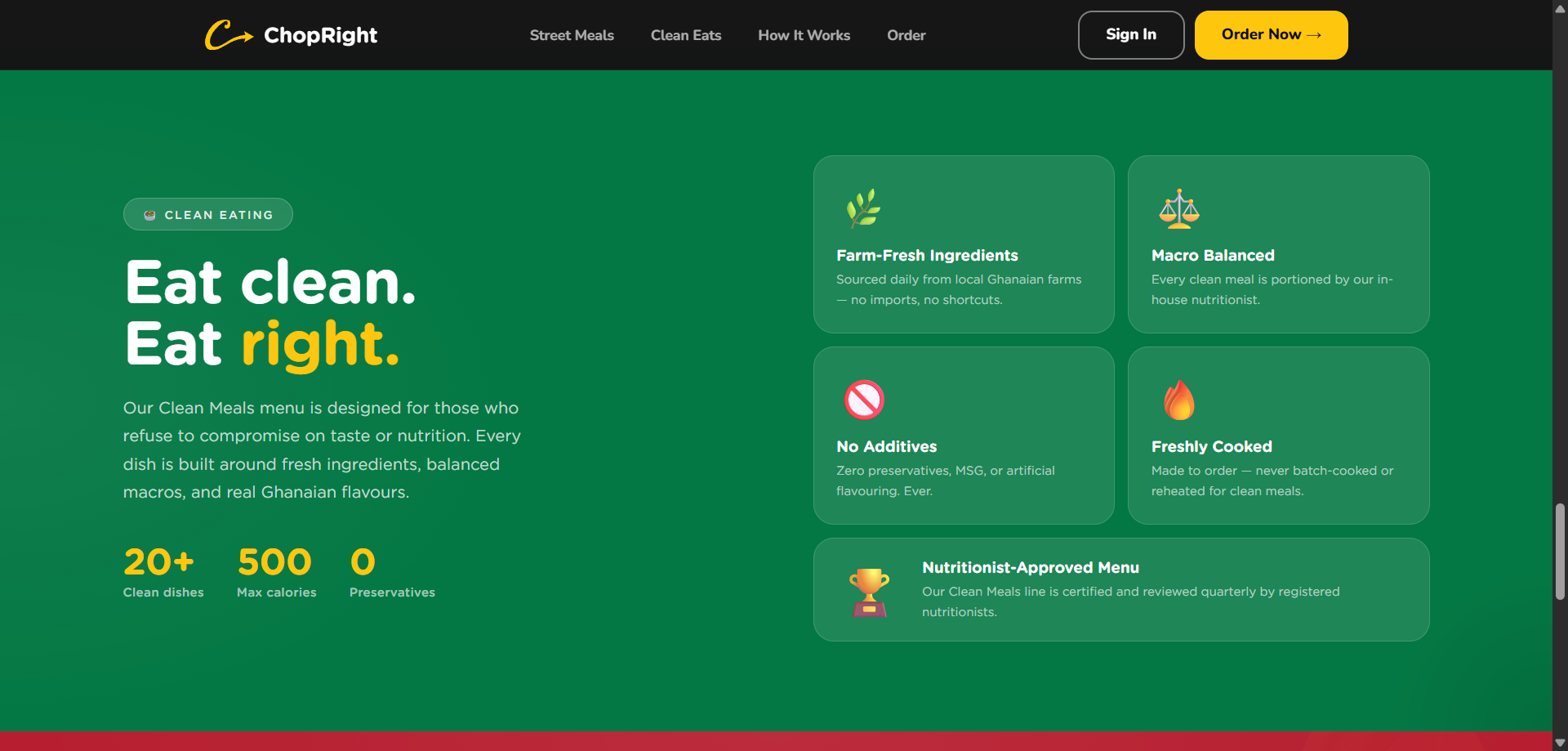
Green, #047844. Reserved for clean, fresh, healthy signals only. Never decorative.
Black, #0D0D0D. Structure. Navbar, footer, body type.
Kraft, #D7BFA3. Packaging and warmth. Used where the brand touches the physical world.
Restraint was the point. Five colours forced every section of the website to mean something. A red section signals action. A green section signals nutrition. A kraft section signals the physical packaging. No section is decorative.
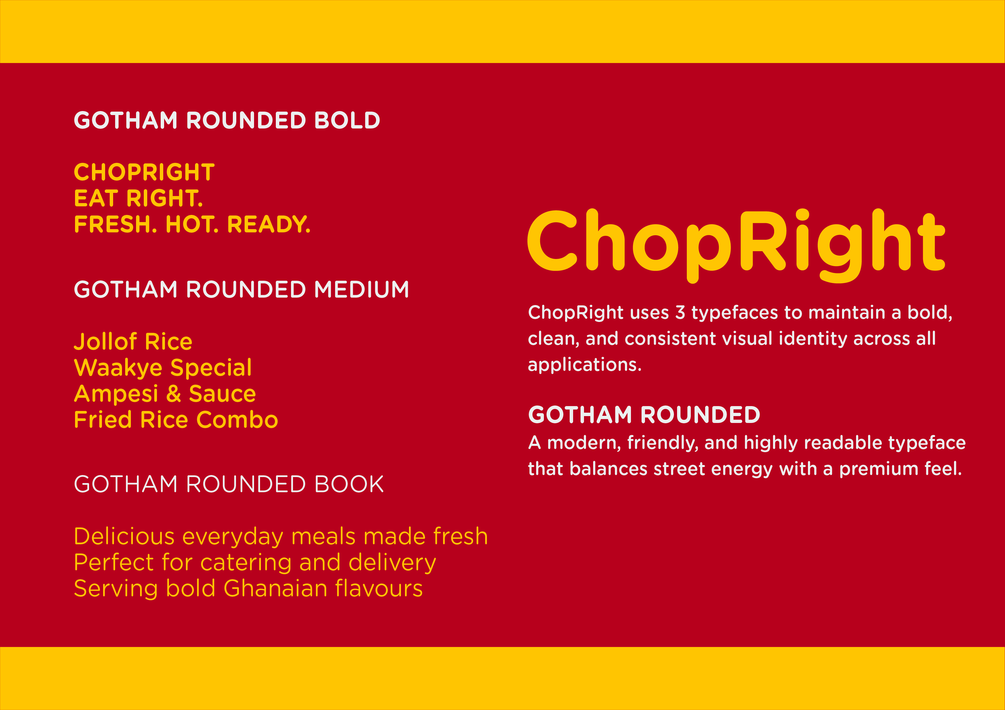
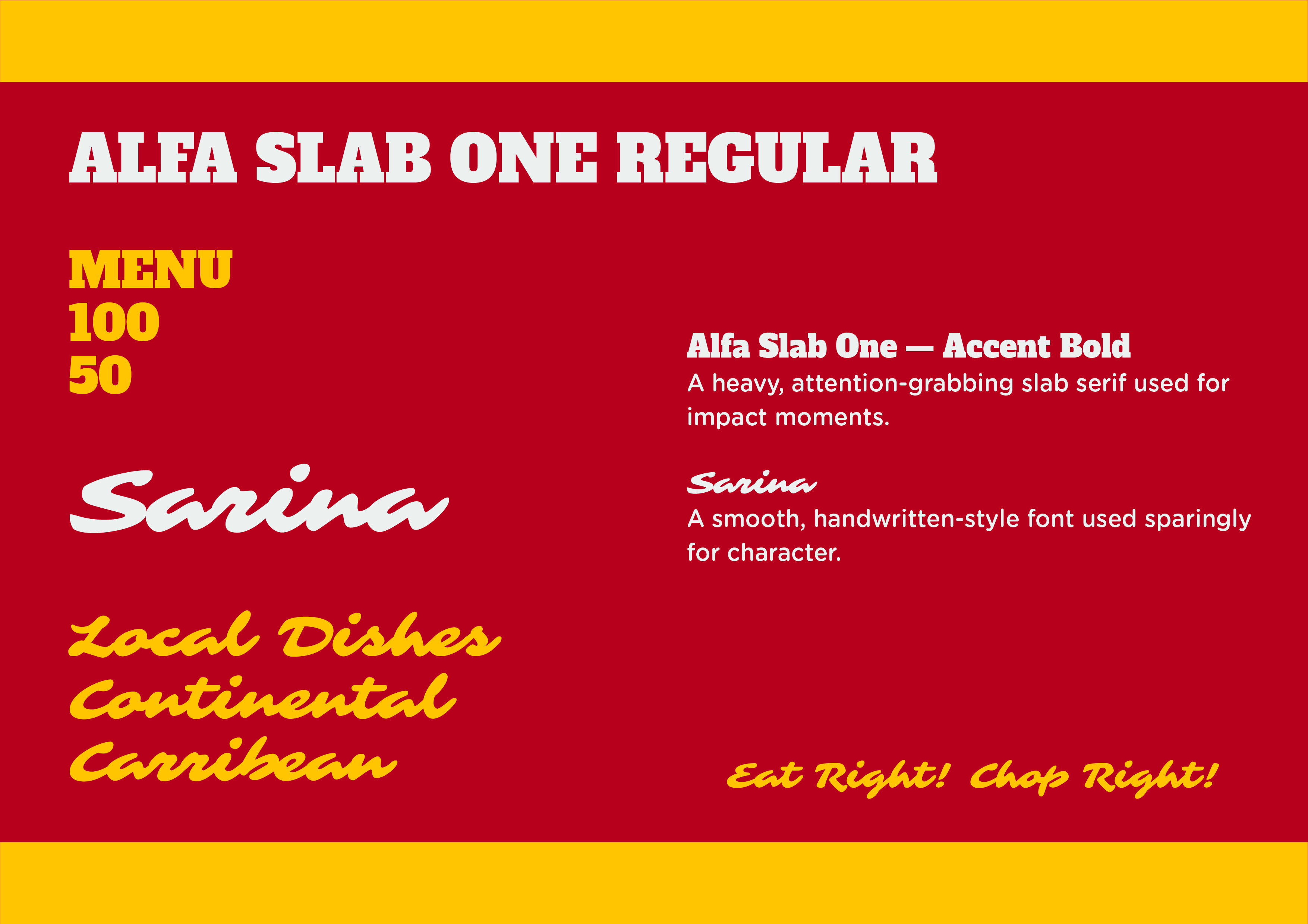
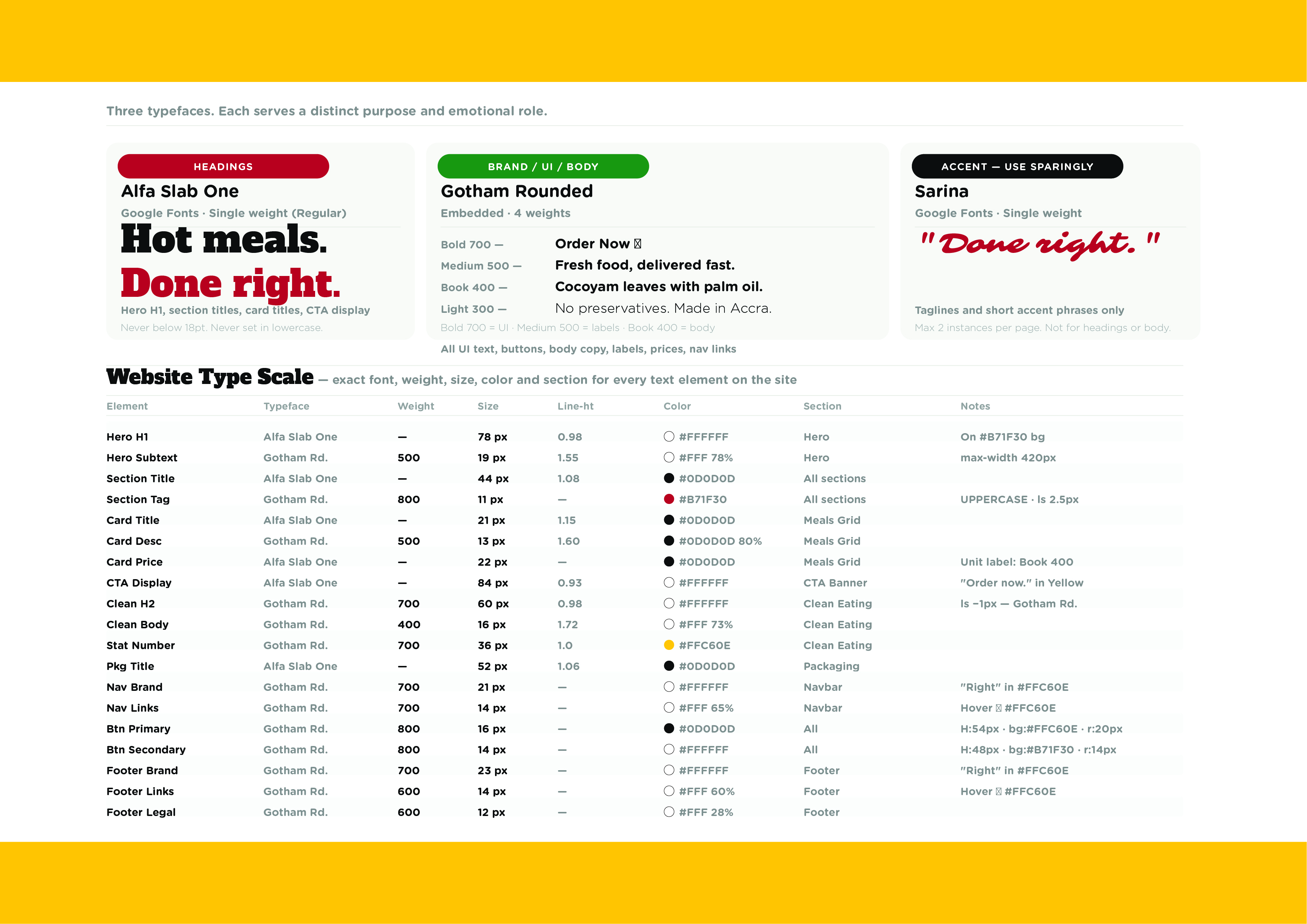
Three fonts. Three roles.
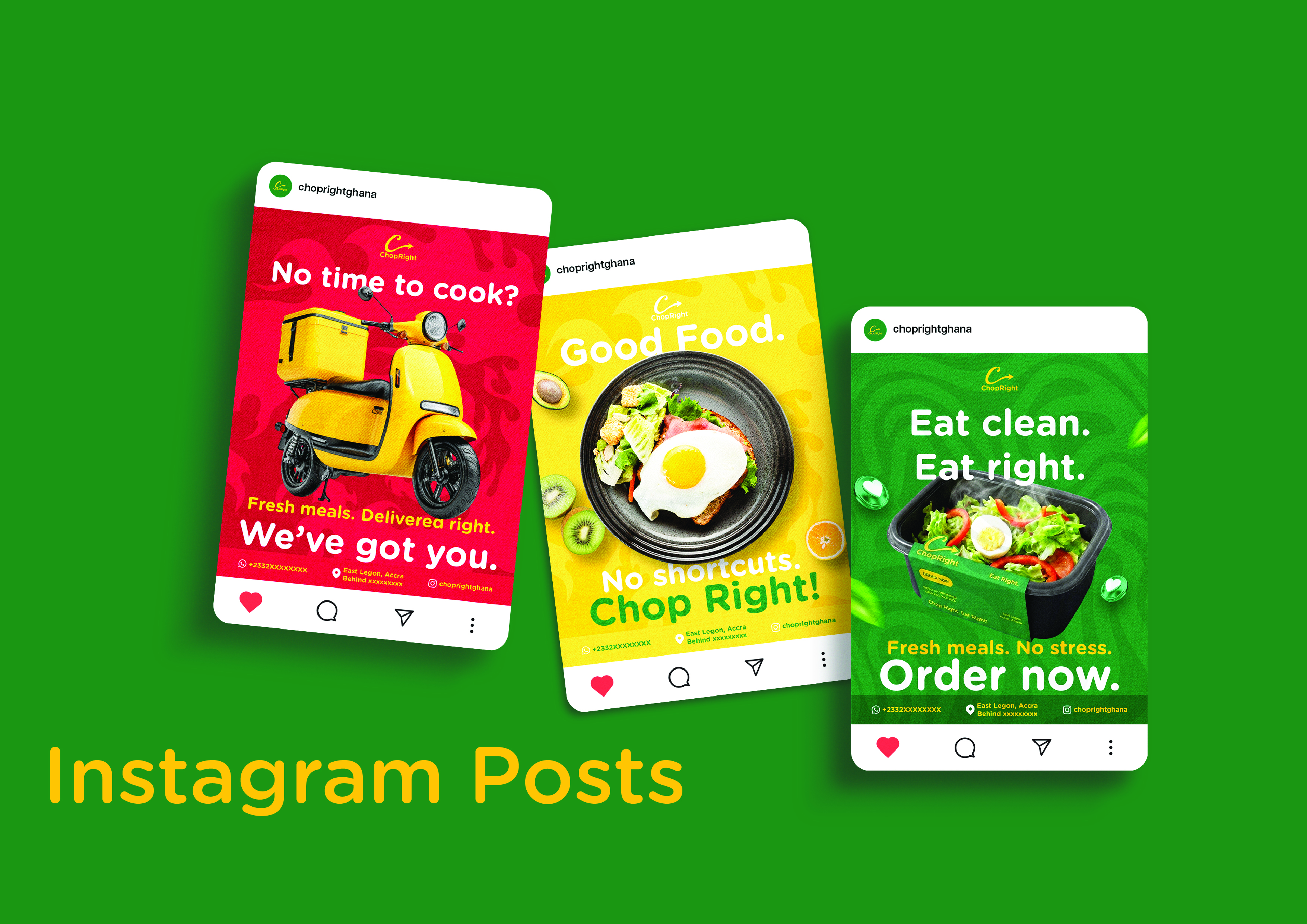
Alfa Slab One is the shout. A slab serif with no subtlety. Used only for headlines and hero statements. When the brand needs to be heard across a feed, this is the voice.
Gotham Rounded is the speech. Four weights — Bold 700, Medium 500, Book 400, Light 300 — cover every body, label, and UI need. Rounded geometry softens the slab above it.
Sarina is the signature. Script. Used twice on the entire site: once in the hero accent, once on the packaging sticker. Scarcity is what makes it work.
The common mistake is to treat type as a menu, picking from twelve weights as needed. I treated it as a cast: three characters, each with a role, never interchangeable. The shout never speaks; the speech never shouts; the signature appears only when there is something worth signing.
Once colour and type were set, every component fell out of them. Buttons are red or yellow — the action colours — set in Gotham Rounded Bold 800, with a 14-pixel radius at every size. Cards have 24-pixel padding because 24 is on the spacing scale. The navbar is black because structure is black.
The spacing system has four values: 16, 24, 40, 80 pixels. That is it. Component gaps are 16. Card padding is 24. Section interior spacing is 40. Section vertical padding is 80. The whole page rhythms on the same four numbers, which is why scrolling feels calm even though every section is loud.
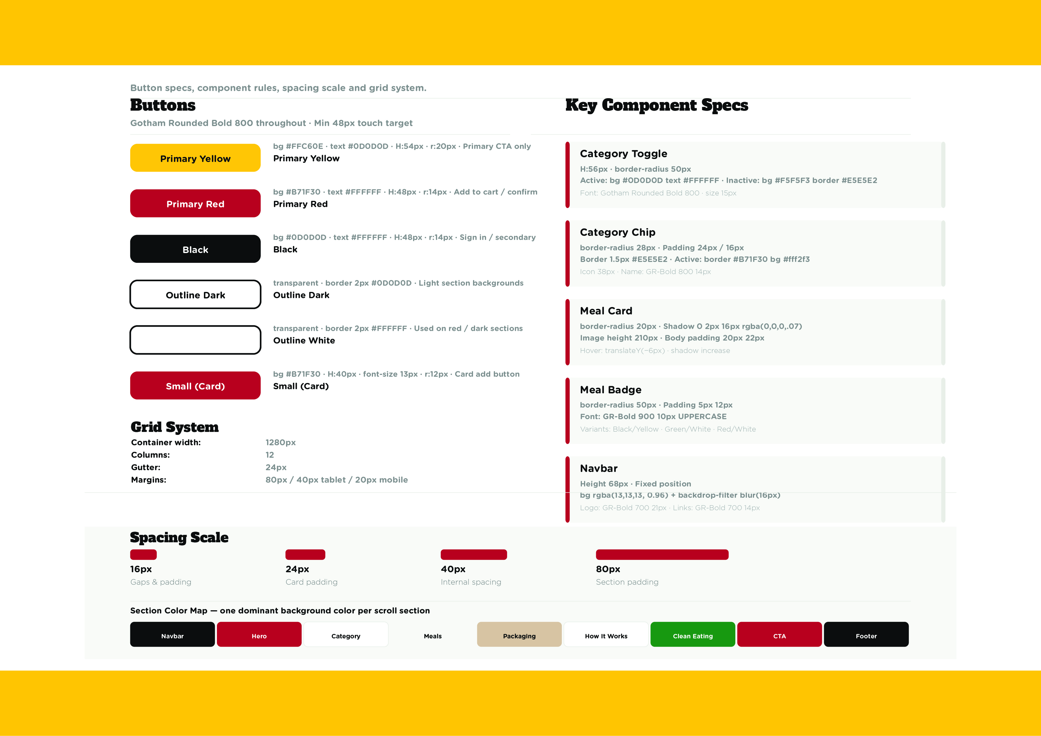
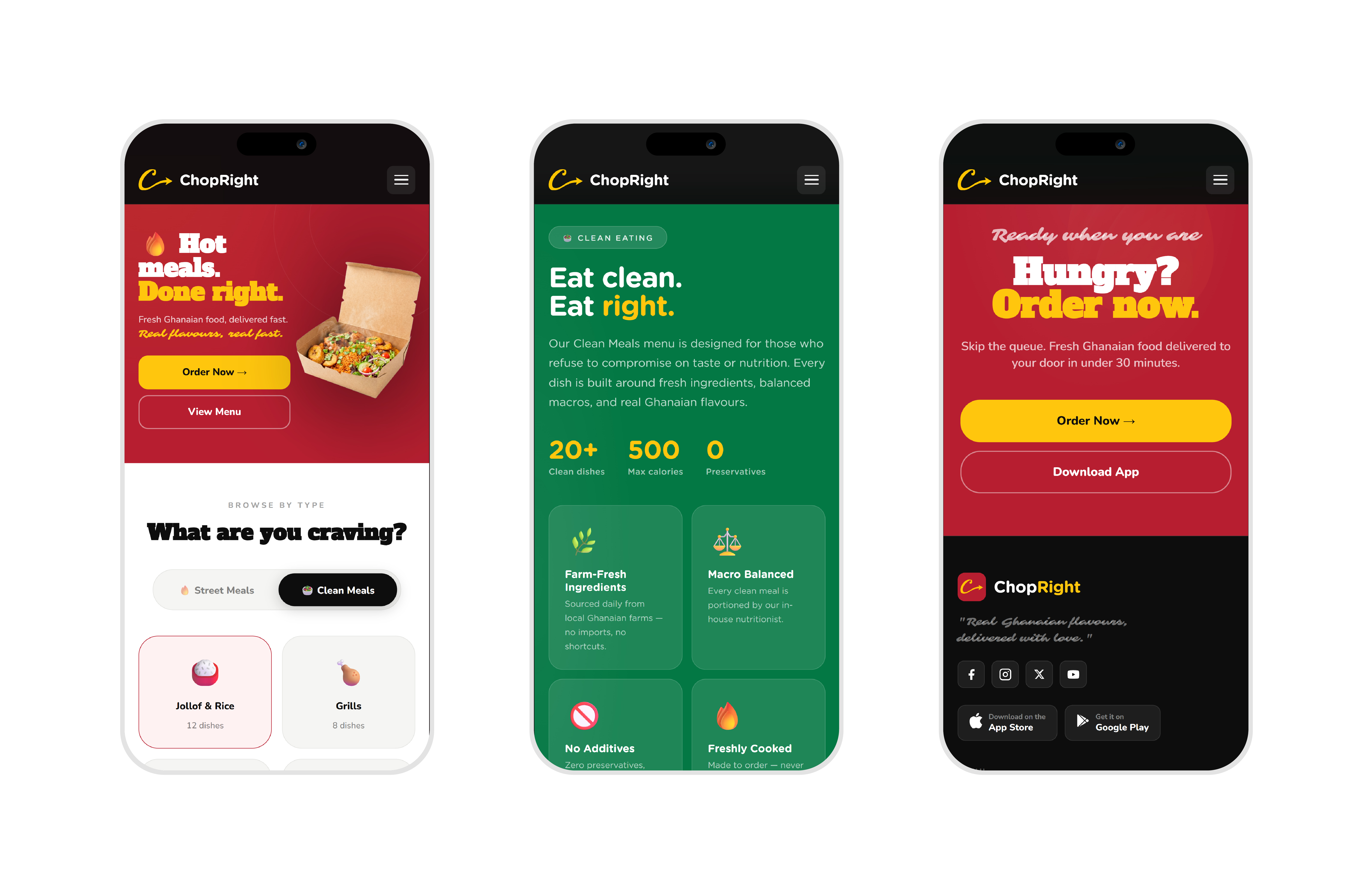
The landing page was designed and built end to end. Same hands, same head, no handoff. Nine sections, each anchored to one of the five colours, all sharing the same type ramp and spacing rhythm. The hero is red — action. The meals grid is neutral grey, so the food carries the colour. The packaging section is kraft, the physical brand. The clean eating section is green, the signal. Sections do not bleed into each other tonally because each section has a job.
Building it myself made the system stricter. Every brand decision had to survive contact with real code, real breakpoints, real touch targets. There was no design file to point at and then walk away from.
The whole page is one HTML file. No framework, no build step. The colour palette and the four-point spacing scale live as CSS custom properties at the top of the stylesheet, so the same tokens that govern the brand book govern the live site. If a value ever needed to change, it would change in one place.
Beyond layout, the build did the work the brand promised. The three Gotham Rounded weights are embedded as base64 woff2 in the stylesheet, so the brand renders correctly on first paint, on any network. No flash of unstyled text. No swapping a system font in for the speech voice.
Every section has a scroll-triggered reveal, but the motion is on a single shared timing curve so the page does not feel like nine different animations stitched together.
The mobile layout went through real iteration. Buttons that wrapped on narrow viewports got fixed without breaking the type scale. The philosophy section became a horizontal scroll strip on small screens because three rectangles never fit cleanly in a column at 375 pixels. The marquees bleed past section padding so they touch both device edges, the way a feed scrolls.
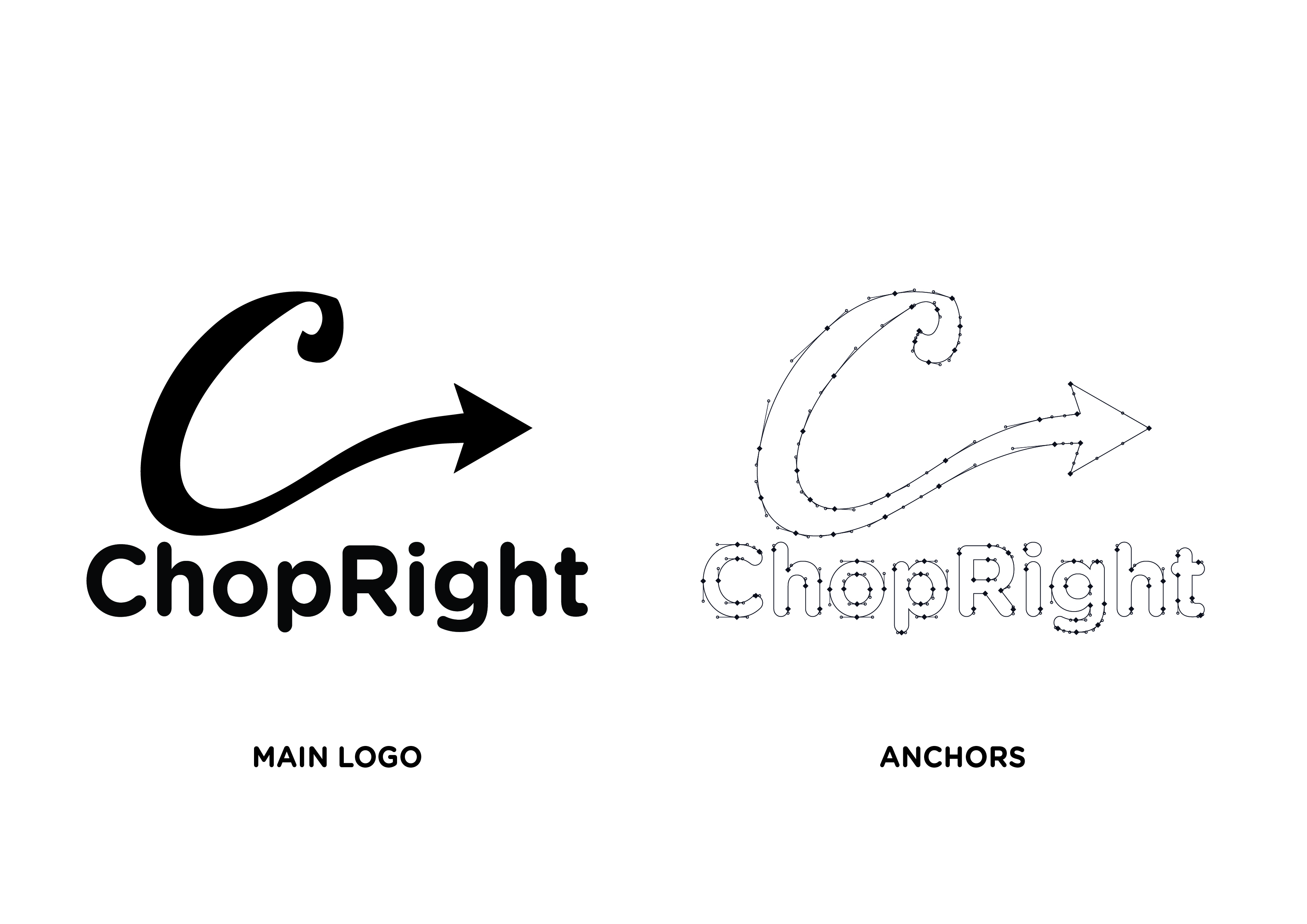
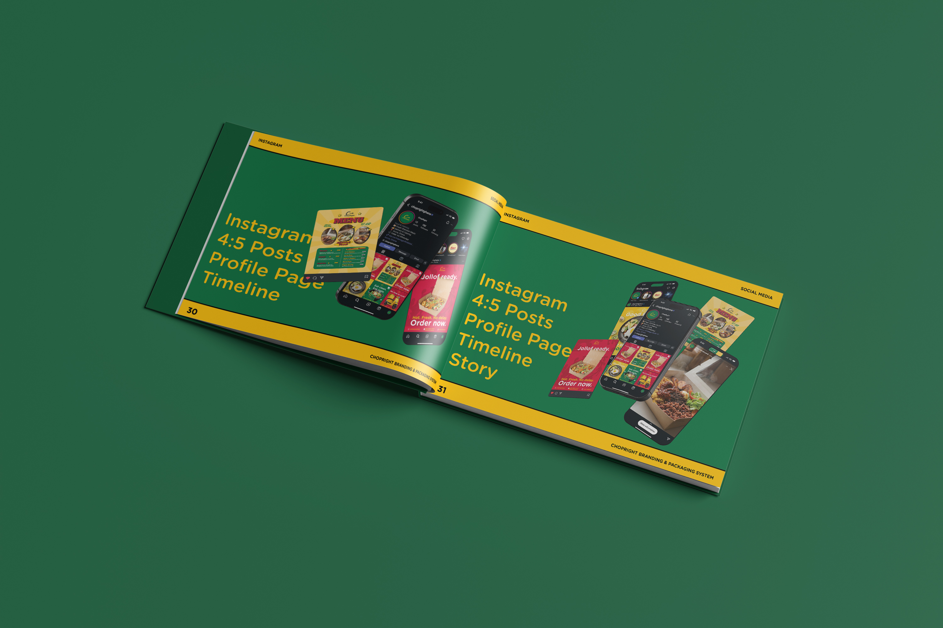
A 38-page landscape document in two formats: a PDF for sharing, and a fully editable SVG for Illustrator handoff with all three fonts embedded so the next designer does not need to chase font files.
The book exists so the system survives me.
The proof of a system is not its diagram. It is what becomes possible after.
A new social post in Canva takes ten minutes because the colours and fonts are preloaded. The mobile rebuild fixed three breakpoints without a single colour change — only spacing and layout shifted — because the rules held. When the team needed packaging stickers, the spec already existed: kraft background, Alfa Slab One headline, Sarina signature, red accent.
The brand book SVG means the next designer who joins does not need a handoff call. The file is the handoff.
The system did the work the team did not have to.
The first version of the brand book exported with the wrong fonts. I had treated the export as a send-it moment instead of as another product. I rebuilt it from scratch: fonts genuinely embedded, XML genuinely valid, every element genuinely editable in Illustrator.
The lesson is that a brand system is only as good as the artefacts that carry it. The PDF is the brand the moment someone opens it.