
Web Design · Web Development · UX Design
A mobile-first link-in-bio landing page with a fully custom booking system — built for a luxury lash extensions studio in Accra and optimised for the Ghanaian digital ecosystem.
In Ghana, most small beauty businesses live on Instagram. The link in their bio is the only bridge between a follower and a booking — and most of the time, that link goes nowhere useful.
Chic Curls, a lash extensions studio in Sakumono, Accra, had the audience. What they needed was a destination: somewhere to send followers that showed what they do, what it costs, and how to book — without leaving the phone.
The constraint that shaped everything: WhatsApp is how Ghanaians confirm appointments. Not email. Not a booking platform. WhatsApp. Any solution that didn't account for that would be a solution nobody used.
Three things were broken before this project started.
No central hub. Pricing lived in highlights. Hours were buried in captions. A potential client who wanted to book had to DM, wait for a response, get the price, confirm a time, and DM again. Every step was friction that cost a booking.
No consistent format. When clients did book through DMs, the studio received incomplete information — no service selected, no time confirmed, a phone number buried in a paragraph. Prep was guesswork.
Wrong audience, wrong design. Most Linktree and link-in-bio tools are built for a Western mobile context. The Chic Curls audience is Accra-based, mobile-first, and expects WhatsApp as the primary touchpoint. A generic template would have felt foreign.
The brief called for something premium. Lash extensions are a luxury purchase in the Accra market — the experience before the appointment should match the experience during it.
The colour system is pink gradient: #FFE5EC to #FF6B9D. Soft enough to feel feminine and luxurious, saturated enough to feel confident and brand-owning. Not pastel. Not aggressive. Right in the middle, where the studio sits.
Typography is a deliberate split: Quicksand for display headings — rounded, elegant, with a softness that fits beauty — and Poppins for body and UI. Poppins doesn't compete with Quicksand; it just works. Readable at every size, every weight.
Component language: corners at 20–30px radius. Soft drop shadows. Glassmorphism on the booking modal steps. The components should feel like they belong in the same world as the lashes — detailed, intentional, delicate.
The booking system is five steps. Each step does one thing. None of them ask for information before the client is ready to give it.
Step 1 — Service Selection. Visual cards. Service name, description, price in GHS. The client picks one and moves. No dropdowns, no forms yet.
Step 2 — Date Selection. A calendar generated dynamically from JavaScript — not a third-party widget, not a datepicker library. Sundays are disabled because the studio is closed. Past dates are disabled because past dates are meaningless. The calendar always opens to the current month and aligns every date with the correct day of the week, regardless of when it loads.
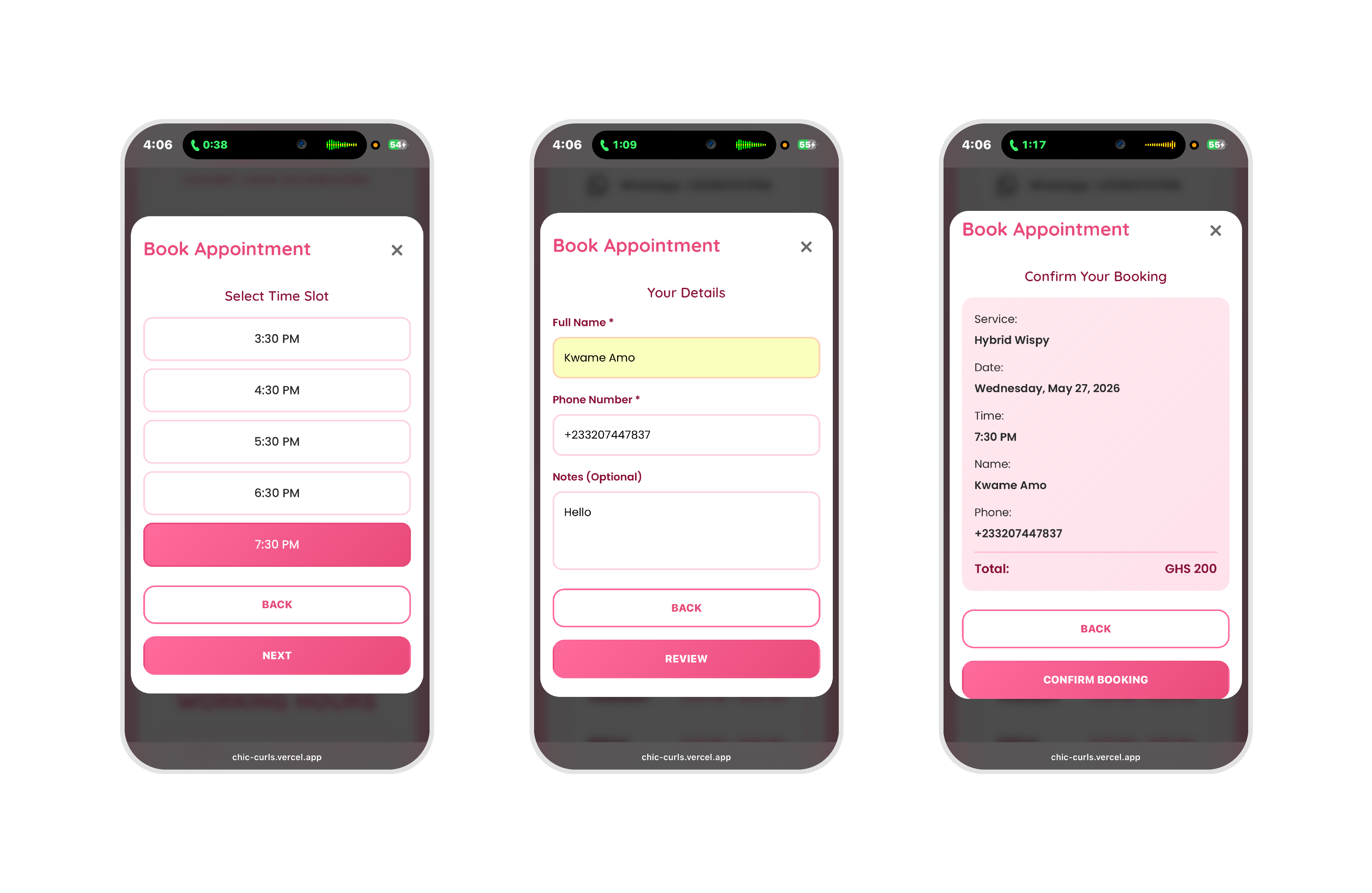
Step 3 — Time Selection. Available slots vary by day. Weekdays: 3:30 PM – 8:00 PM. Saturdays: 8:00 AM – 8:00 PM. Slots are generated based on the selected date, with past slots on today's date removed in real time. Single-column layout on mobile; the tap targets are large enough to work without precision.
Step 4 — Customer Details. Name and phone number. An optional notes field. Three fields. Nothing more than what the studio needs to prepare.
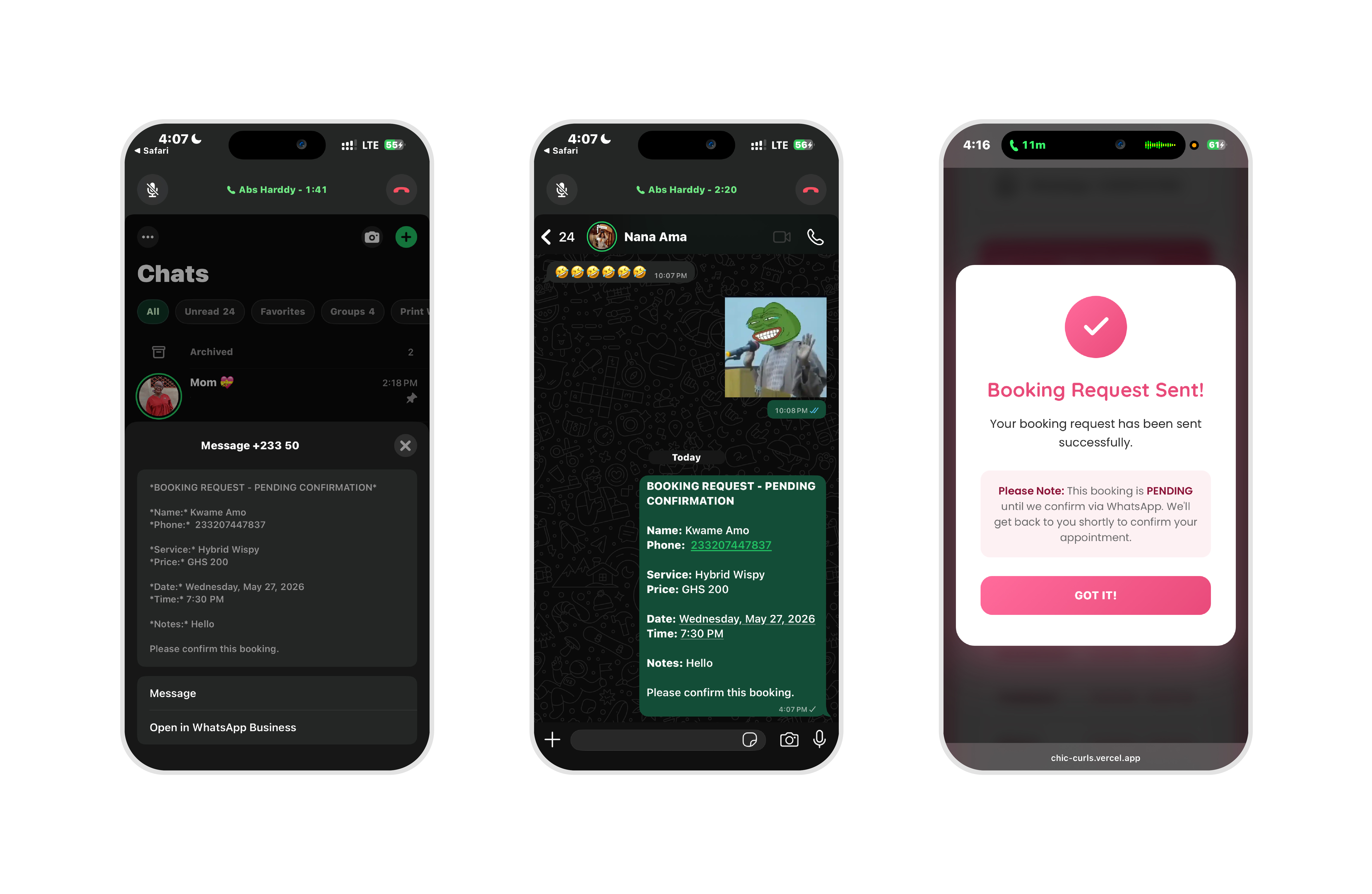
Step 5 — Confirmation. A summary of the booking before the client commits. Service, date, time, contact details. One button. It opens WhatsApp Web with the booking pre-formatted — service, date, time, name, phone, notes — so the studio receives a message it can act on immediately.
Every step validates before advancing. Missing a required field produces a branded modal, not a browser alert. The modal matches the page. The page feels consistent.
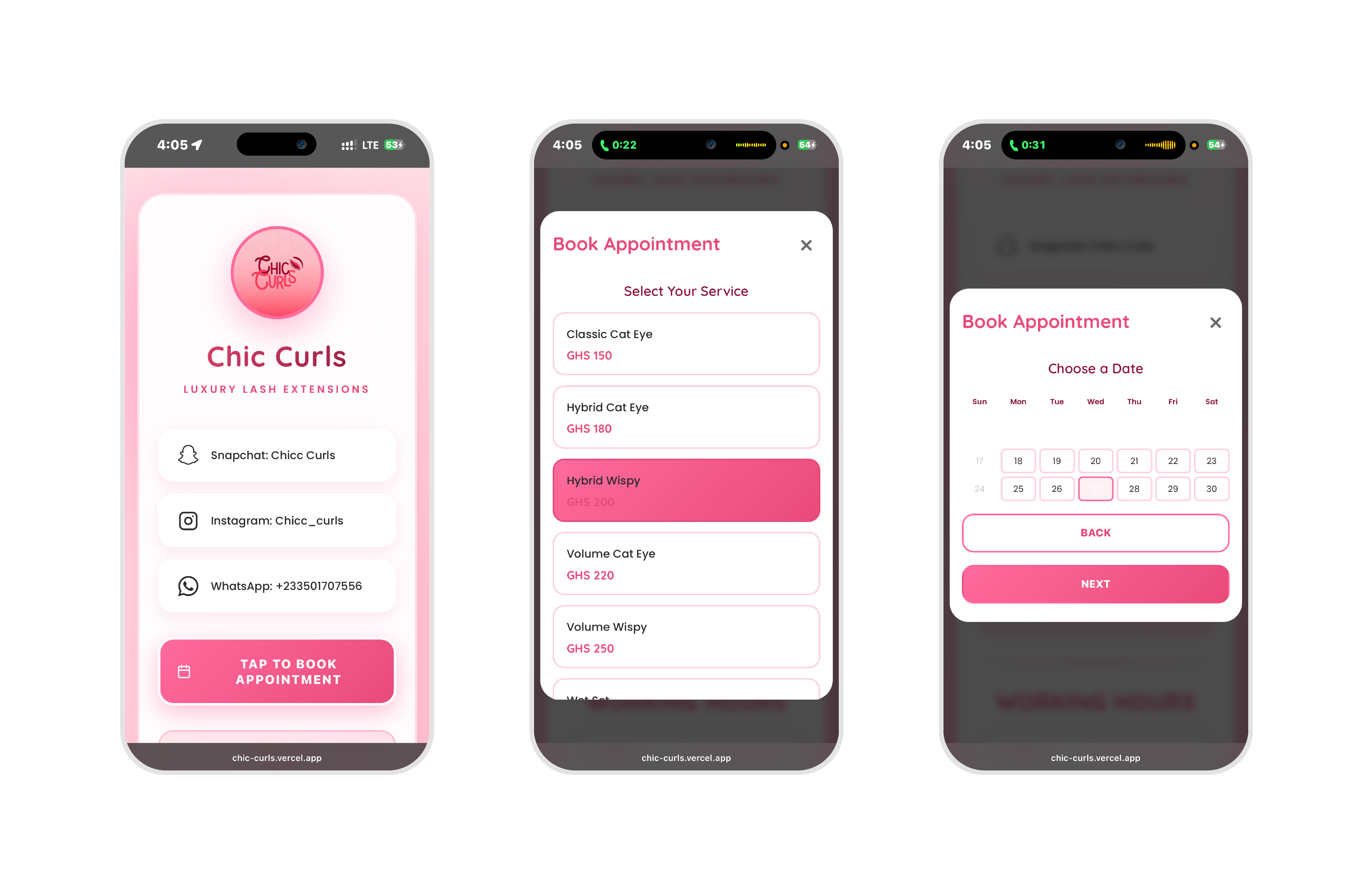
All pricing displayed in Ghana Cedis. No ambiguity, no "contact for pricing." The client knows what they're booking before they start the flow.
Classic Sets from GHS 150. Hybrid Sets from GHS 180. Volume Sets from GHS 220. Signature Sets from GHS 230 — up to GHS 340 for the flagship treatment. Refills from GHS 70. Extras for coloured lashes, button lashes, and removal.
The pricing structure being visible upfront does two things: it qualifies clients before they book, so the studio doesn't spend time on enquiries that go nowhere, and it builds confidence — a studio that shows its prices clearly is a studio that has nothing to hide.
No framework. No build step. One HTML file, one stylesheet, one script.
The decision was deliberate. A framework would have added complexity with no benefit for a single-page marketing and booking tool. Vanilla JavaScript is fast to load, fast to parse, and has no dependency graph to maintain. The client gets a site that works; there is nothing to update, no packages to audit, no build pipeline to break.
The calendar is a custom implementation. It generates the correct number of days for any month, aligns the first day with the right column in a 7-day grid, and handles leap years. There is no date library involved — the logic fits in under 80 lines.
State management across the five booking steps runs on a plain JavaScript object. Each step reads from and writes to it. The object is reset on modal close. No framework needed to manage five fields.
Scroll lock activates when any modal opens, so the booking flow doesn't compete with the page behind it. The lock releases cleanly on close. On mobile, this is what separates a modal that feels native from one that feels broken.
Deployment on Vercel. The site is on a CDN edge, loads under a second on a 4G connection, and has no server to maintain.
The audience is on phones. Not laptops. Not tablets. Phones — and in most cases, iPhones on small screen sizes.
The calendar grid was the hardest mobile constraint. Seven columns on a 375px screen. Each cell needed to be large enough to tap without hitting the adjacent date. The solution was a 28–32px cell size with precise padding, calibrated on an iPhone 14 Pro. It fits. It works. It required actual iteration on actual hardware, not just viewport emulation in DevTools.
Time slots are single-column on mobile. Two columns on wider screens. The tap target for each slot is the full row, not just the text label.
Modal padding and font sizes reduce on small screens so the booking flow fits in the viewport without scrolling mid-step. The client sees the whole step, selects, and moves — no hidden content below the fold.
Minimum tap target across the entire page: 44×44px. No exceptions.
The studio went from scattered DMs to structured bookings. Every WhatsApp message from the new site arrives with the same format: service, date, time, name, phone, notes. The studio can confirm and prepare without a follow-up question.
The link in the bio is now a destination: pricing, services, hours, social links, and the booking flow — everything in one place, no app required, no account to create.
The WhatsApp integration was the right call. It met the client's customers where they already were. The tool that looked like a limitation — using a messaging app instead of a proper booking platform — turned out to be the feature. Ghanaian clients don't want to create an account to book a lash appointment. They want to send a WhatsApp message. The site makes that message automatic, complete, and professional.
The most important decision on this project wasn't a design decision. It was the WhatsApp integration. Everything else — the calendar logic, the step validation, the mobile tap targets — was execution. The integration was the insight.
Understanding how a market actually behaves, rather than how a software template assumes it should behave, is the difference between a solution that gets used and one that gets abandoned.
Build for where people are. Not for where your tools assume they are.